Let’s talk fonts! The font you choose plays a crucial role in how your brand is perceived. Choosing the right font that is right for you is important to communicate brand identity. With over 200,000 fonts to choose from, it can be an overwhelming task.
When choosing a font that is the right fit for your brand, firstly you should ensure it aligns with the purpose of the brand. For example, fonts with serifs (such as Times New Roman) are typically used in print and are fitting for a formal document whereas sans serif fonts (such as Arial) are popular for digital mediums and are very fitting for a modern brand.
Things to consider when choosing a font
A font with good readability is essential, especially for body text. You should consider the font size, spacing between individual letters as well as how it displays on different media. Ensure the font you choose works is versatile and works well on screens, business cards and billboards.
Fonts add personality! Your chosen font should also match the tone of your brand and content. For example, what you use for a wedding invite probably won’t be what you use for a quarterly report.

So, what are some 2024 font trends you can follow?
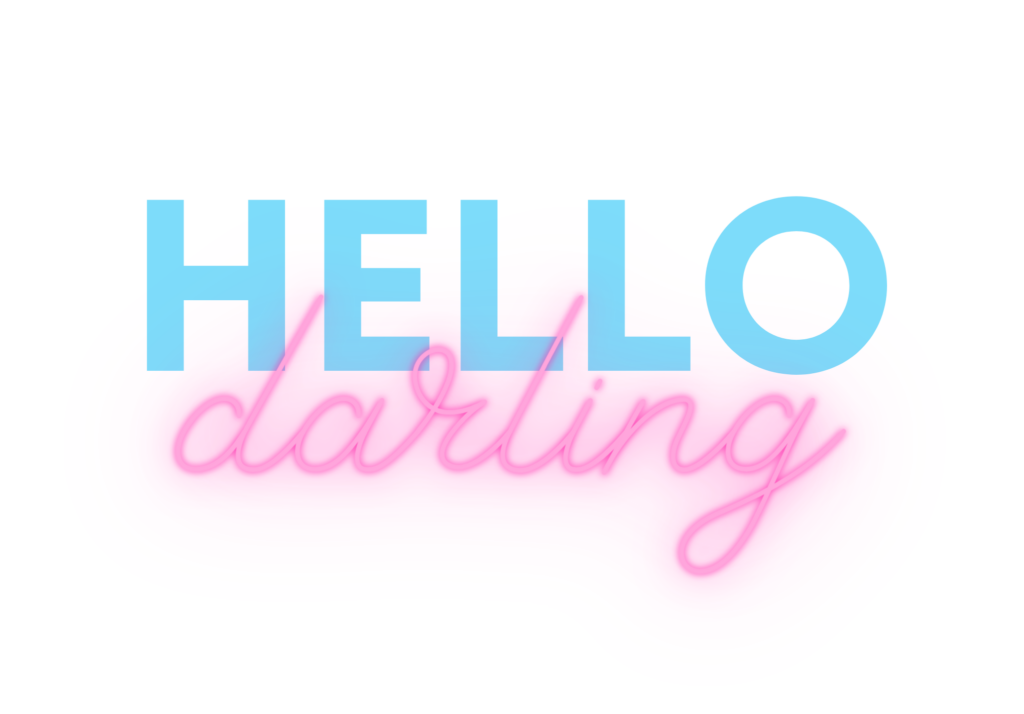
1) Contrasting Fonts
Using contrasting and clashing fonts is an emerging trend which can help your brand stand out. The visual contrast and hierarchy make key messages stand out. Pairing a bold font with thick and an italic script font is an eye-catching way to communicate a brand.

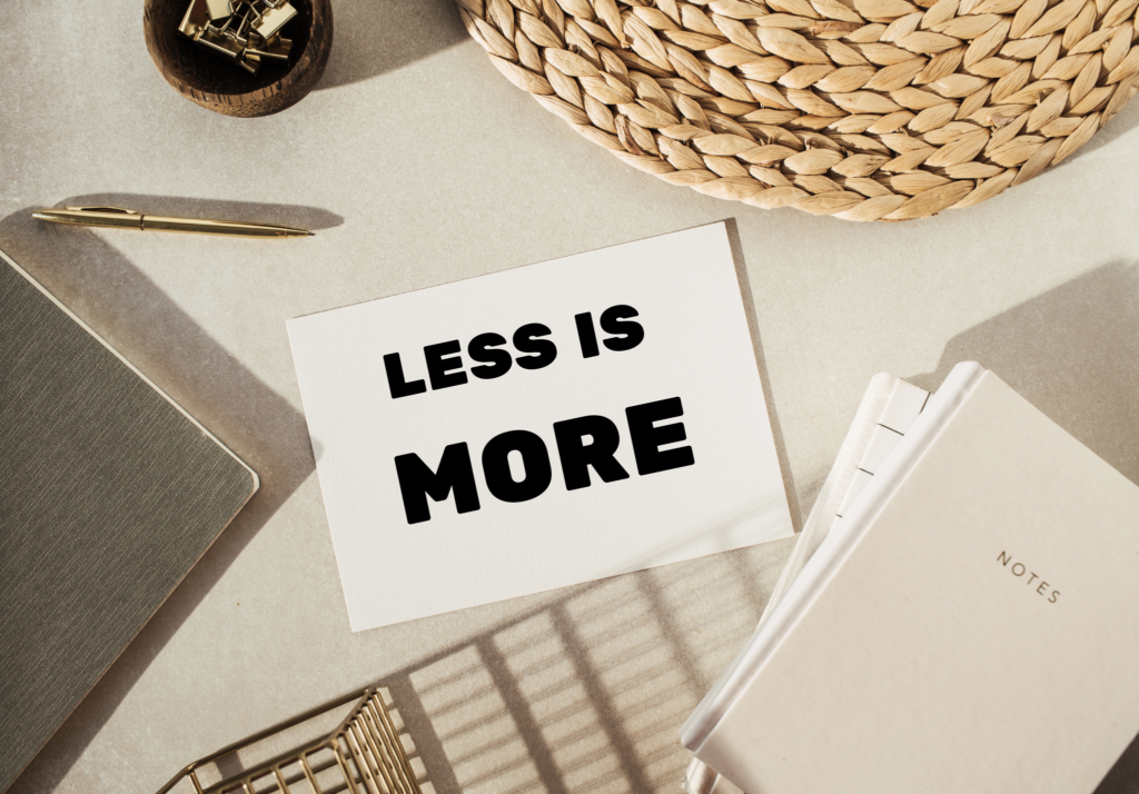
2) Bold Minimalism
Bold minimalism, and the ‘less is more’ perspective has stood the test of time and remains one of the more popular font choices. Bold minimalism is typically used in videos, branding, and design. The clean, striking nature of the visuals make an impact and are powerful for communication.

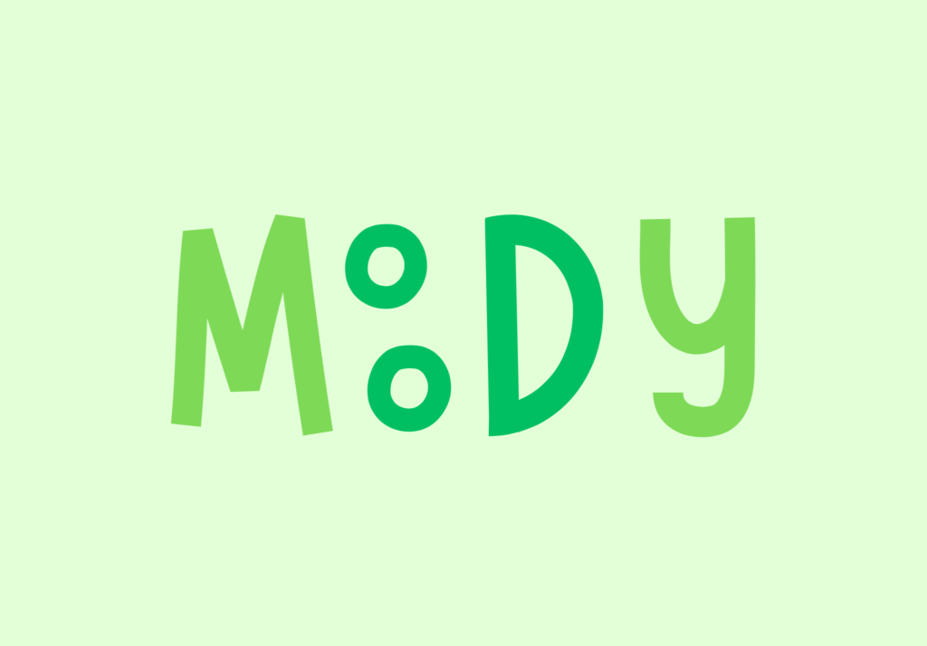
3) Playful Design
Playful design is a trend centred around having fun with design. Along with your chosen font, the addition of elements like quirky illustrations and gifs are engaging to an audience and keep them entertained. Playful design infuses personality and allows you to play with colour palettes, illustrations and to think outside the box.

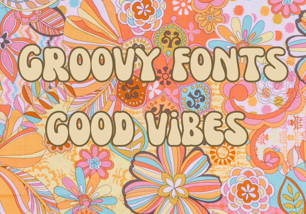
I am currently loving the rise of retro fonts in the last year. I love how funky they are and the vibe they add to graphics. Retro fonts are great to convey a sense of nostalgia and heritage as well as adding unique character and style. While having a classic look, they have more modern features.
Specifically, I am enjoying groovy retro display fonts such as Nectarine. I like how the letters fit together and how the letters are not the same thickness throughout. Fun colour palettes also translate with retro fonts to bring your design to life!

Overall, your font choice matters! It is important to spend time selecting a font that fits your brand and brand aesthetic. It is key to have a font that translates on different mediums. But ensure to play around with different fonts and trial them because making your brand stand out is how people will remember you.
At Ripple Marketing, we understand how important it is to tell your brands story to ensure the success of your business. Get in touch with our creative team now to see how we can boost your branding – [email protected].

Written by Lauren Redfern
| Cookie | Duration | Description |
|---|---|---|
| cookielawinfo-checbox-analytics | 11 months | This cookie is set by GDPR Cookie Consent plugin. The cookie is used to store the user consent for the cookies in the category "Analytics". |
| cookielawinfo-checbox-functional | 11 months | The cookie is set by GDPR cookie consent to record the user consent for the cookies in the category "Functional". |
| cookielawinfo-checbox-others | 11 months | This cookie is set by GDPR Cookie Consent plugin. The cookie is used to store the user consent for the cookies in the category "Other. |
| cookielawinfo-checkbox-necessary | 11 months | This cookie is set by GDPR Cookie Consent plugin. The cookies is used to store the user consent for the cookies in the category "Necessary". |
| cookielawinfo-checkbox-performance | 11 months | This cookie is set by GDPR Cookie Consent plugin. The cookie is used to store the user consent for the cookies in the category "Performance". |
| viewed_cookie_policy | 11 months | The cookie is set by the GDPR Cookie Consent plugin and is used to store whether or not user has consented to the use of cookies. It does not store any personal data. |